SUGARED + Bronzed
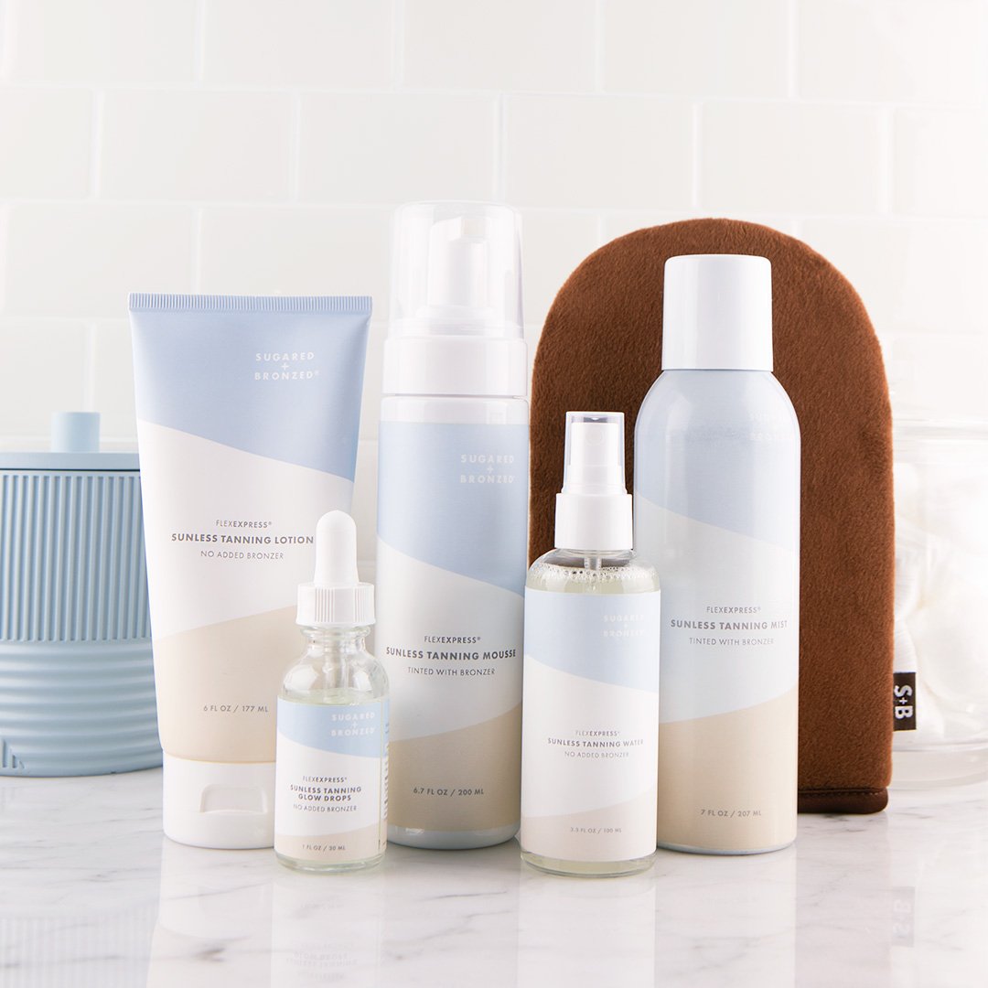
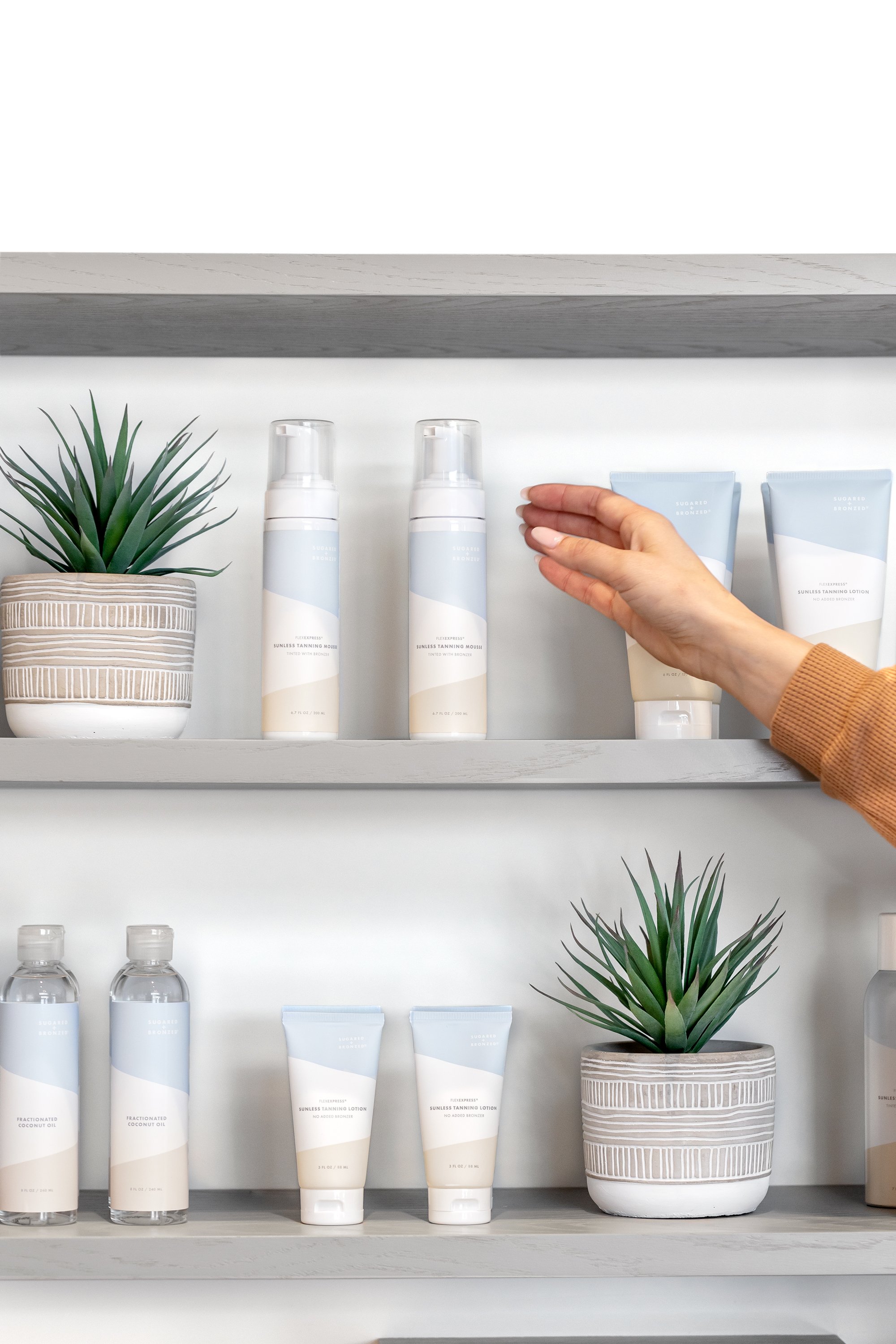
FEEL FLAWLESS // What started off as a packaging redesign project turned into new pre and post-opening storefront graphics and an updated brand look. A secondary color palette was created to complement the brand's existing bolder blue and brown colors. It was also important that the blue (associated with sugaring) and tan color (associated with tanning) worked together to play on the two services offered.


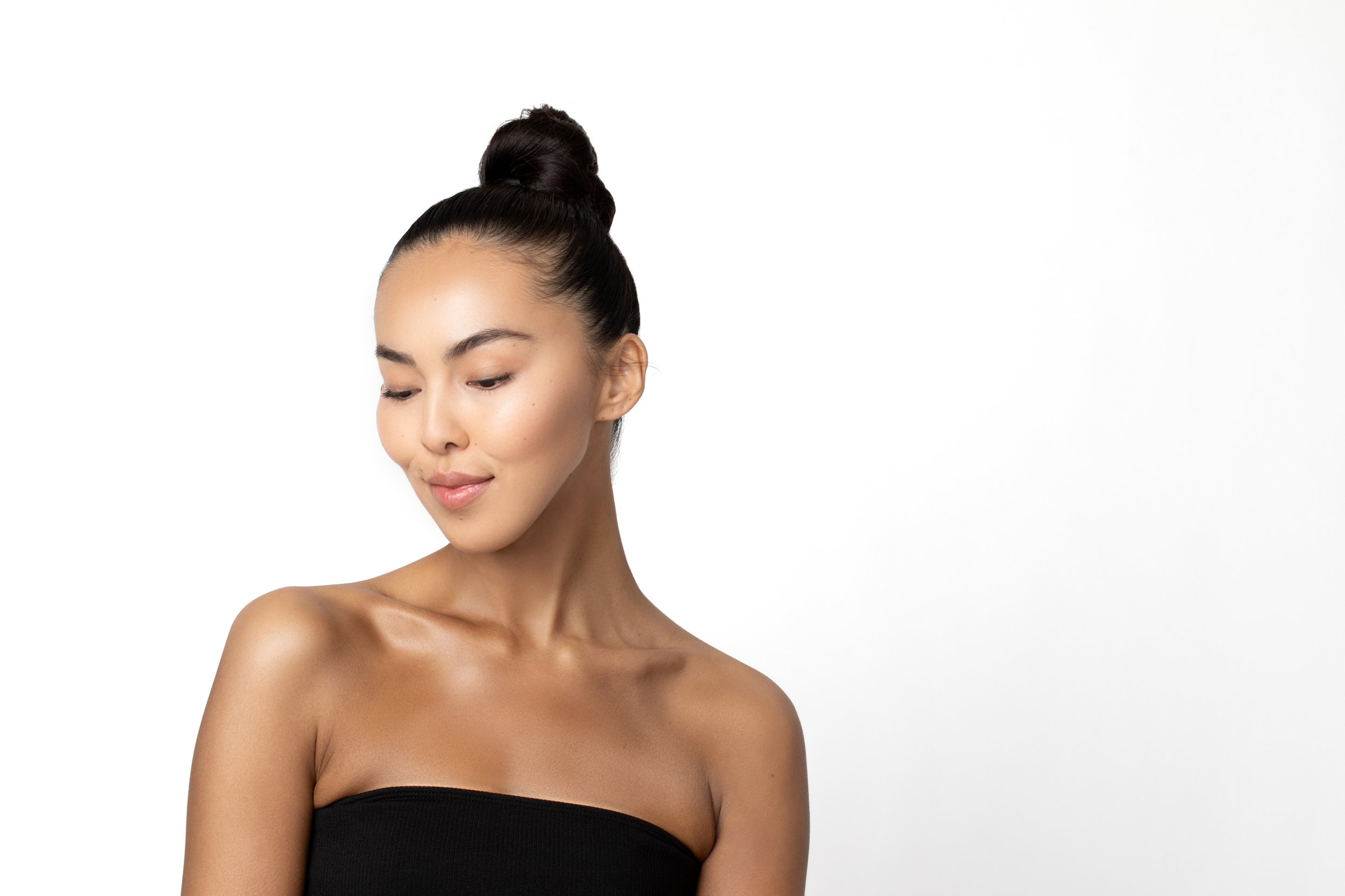
PHOTO EDITING & RETOUCHING
BEFORE


AFTER


BEFORE


AFTER


